
Art lighting design is the practice of putting controlled, color accurate, correctly aimed light on a work of art while limiting the total amount of light that work receives over its lifetime. It is governed by two numbers rather than one, how bright the piece is and how many hours it spends that way.
Hang a watercolor across from a west facing window and you have already decided how it will look in fifteen years. The decision gets made without anyone noticing, and no fixture you add afterward will undo it.
The usual sequence runs like this. The art arrives after the house is finished. Someone adds picture lights, or aims whichever two downlights the electrician placed near that wall. Everyone agrees it looks better. Nobody measures anything, and nobody asks the question that decides the outcome, which is how much light that piece takes in over a year.
Light is not a setting. It is a quantity, and your collection is spending it right now.
Conservators do not talk about brightness. They talk about dose, which is illuminance multiplied by hours, expressed in lux hours. A piece held at 50 lux for eight hours a day collects what a piece held at 200 lux for two hours collects. The light does not care which way you got there.
Two consequences follow, and both are uncomfortable.
The damage accumulates, and it never resets. Dimming the room next year slows the spending, it does not refund anything already spent.
And it is not reversible. A conservator can do a great deal for a torn sheet or a yellowed varnish. Faded pigment is simply gone.
So there are three levers. How bright the work is, how many hours a day it is lit by anything, and whether it is on the wall at all.
Conservation practice has settled on three tiers, and they have held for decades.
Most rooms, lit for ordinary use, sit well above the level a conservator would allow for anything on paper. That is the gap nobody sees, because the wall looks fine and the consequence arrives slowly.
Museums also use a lever homes never use. Sensitive works go up for a few months and then rest for years. In a house, the most fragile thing anyone owns is usually hung in the brightest hallway and left there. If you own something on paper that matters to you, the honest answer may be that it should not be on permanent display.
Ultraviolet is the energetic end of the problem. The museum target is under 10 microwatts per lumen as the ideal, with 75 as the outer limit.
Modern LED sources emit essentially none, which quietly solved a problem halogen, incandescent, and fluorescent lamps all created. That is real progress, and also where most people stop reading.
Removing the ultraviolet does not remove the risk. Visible light fades fugitive colorants on its own, with no help from the invisible spectrum. A zero ultraviolet fixture pointed at a watercolor at 300 lux for ten hours a day is still spending that watercolor. The dose is the dose.
A watercolor lit to 50 lux looks less saturated than the artist mixed it. That is not a failure of the fixture. Colorfulness falls at low light levels, and conservation levels are dimmer than the levels at which a work looks most vivid. Anyone who says there is no cost is selling you something.
The way out is not more light on the art. It is less light on everything else.
The eye reads relative brightness, not absolute brightness. A piece at 100 lux in a room running at 30 lux is luminous. The same piece, at the same level, in a room running at 300 lux is flat. You did not change the art. You changed what it is competing with.
Contrast is the most valuable tool in this discipline, and the only one that costs the collection nothing. Deciding what to leave dark is what makes the art appear, which is the argument that runs through every layer of a residential lighting design.
A wall that catches a few hours of direct afternoon sun can take in more light energy in a season than a carefully lit museum piece sees in a year. Every fixture decision in this article is rounding error next to that one.
Colorado sharpens it. Thinner atmosphere means more ultraviolet arriving in the first place, the clear day count is high, and in winter snow reflects light back up through the glass onto walls that were safe in July.
The fixes go in this order, and most people run it backward.
Placement first. Which wall a piece hangs on is a conservation decision, not only a composition decision. The best wall for looking at a painting is frequently the worst wall for owning it.
Then the window treatment. Shades and drapery cut the visible dose, which is what actually fades fugitive colorants, so this is the one intervention that addresses both halves of the problem. It is also the one that fails in practice, because the manual version depends on somebody remembering at three on a Tuesday afternoon. Motorized shades on a schedule happen whether anyone is home or not.
Then film on the glass. A good ultraviolet filtering window film removes most of the ultraviolet entering the room and protects everything inside at once, including unframed work. It does not stop fading, and nobody in the film industry claims otherwise.
Then glazing at the frame. Conservation grade glass and acrylic block roughly 97 to 99 percent of ultraviolet, and anti reflective versions solve a second problem at once. Many oil paintings are conventionally displayed without glazing, so this lever belongs mostly to works on paper and photographs, which are the pieces that need it most.
The standard starting angle for a ceiling fixture aimed at a flat work is roughly thirty degrees from vertical, with the beam landing at the center of the piece. It is a starting point rather than a law, and the reason is worth understanding.
Light reflects off a surface at the same angle it arrives. At thirty degrees, the bright bounce off glass or varnish lands below the eye of somebody standing in front of the work. That is the whole trick. You are not eliminating the reflection, you are aiming it at the floor.
Move the fixture closer to vertical and the light rakes the surface. The frame throws a shadow across the top of the work, canvas weave and impasto get exaggerated, and deep frames suffer first.
Move it the other way, so the light arrives closer to head on, and the reflection climbs into the sightline. On glazed or varnished work it becomes a bright veil over the painting, and the viewer solves it by stepping sideways, which is the quiet sign that the lighting lost. The final aim is never set from a drawing. It is set on site, against that piece, from where people actually stand.
Beam spread matters nearly as much as angle. A beam wider than the piece spills onto the wall and announces that the art is being lit. A beam slightly narrower than the frame lets the work appear to glow on its own.
Picture lights. Mounted to the frame or the wall just above it. Intimate, visible by design, and therefore a finish decision as much as a lighting one, so the metal should agree with the hardware in the room. Even coverage on a tall work is the limitation, and a wide canvas sometimes wants two.
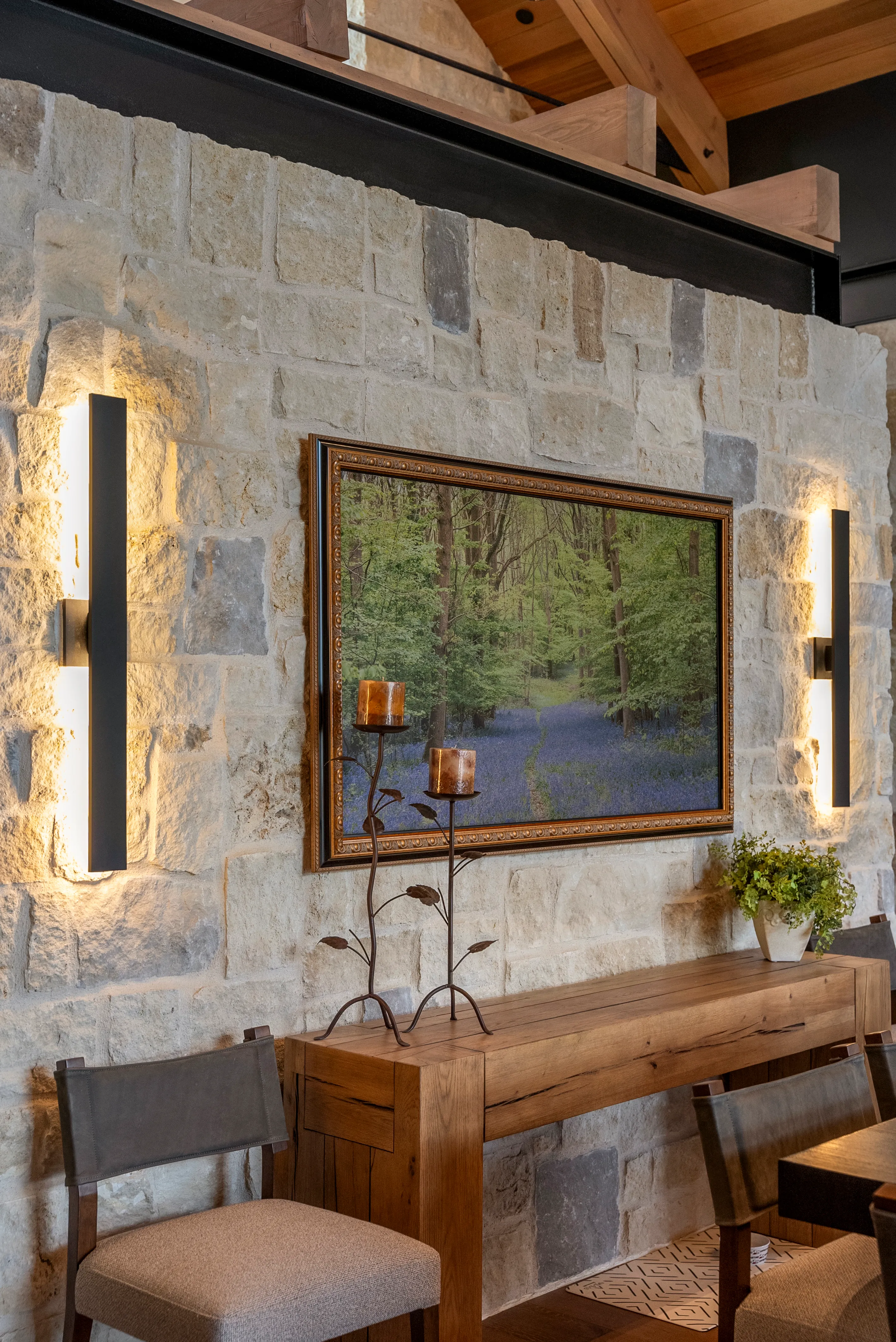
Adjustable recessed accents. The default in new construction and the cleanest ceiling. The catch is coordination. The fixture goes where the framing allows, the art goes where the architecture wants it, and the two have to be reconciled on paper months before either exists.
Track. The honest answer for a collection that moves. Heads slide, aim changes, and nothing has to open a ceiling when the wall gets rehung. The cost is that you see it, which under a plaster vault is usually the wrong trade and on a working gallery wall is usually the right one.
Framing projectors. Shutters inside the fixture cut the beam into a precise rectangle, so the light stops at the edge of the frame and the painting appears to be lit from within. Nothing else produces that effect. The requirements are real, though. They want low ambient light, a limited throw distance, and exact coordination, because the fixture is aimed at one object of one size in one position. Hang something else there later and the effect has to be rebuilt.
Everything above assumes a flat object, where the goal is even illumination across a plane. A three dimensional work wants the opposite. It wants modeling, which means it wants shadow, and it has to read from every approach in the room rather than from the one angle it was photographed in.
A single source does one of two things to a sculpture. It flattens the form, or it throws a hard black shape on the wall behind it that upstages the object.
The working approach borrows from portraiture. A stronger source from one side to describe the form, a softer one from the other to keep the shadow side readable, and a decision about where the cast shadow falls.
Patinated bronze, polished stainless, and glass follow a separate rule, because a reflective object does not show you light. It shows you the room. The question is never how to light the surface, it is what you want the surface to borrow, which is the logic that governs every material in the house.
Two fixtures with identical output can render the same canvas accurately or not at all, and the specification sheet rarely makes it obvious. The commonly quoted color rendering average leaves deep red out of the calculation, which is why the separate deep red value is the number to ask for when reds, earth tones, and skin are in the room.
One rule beyond that. Every fixture aimed at art in a room should be the same source and the same color temperature. A single mismatched fixture makes one canvas look jaundiced beside the next, and the owner usually blames the painting.
It is almost never the concept. It is the handoff.
The ceiling locations were set before anyone knew what was being hung. The aiming never happened after dark, because the crew was there during the day. The gallery scene exists in a plan and was never programmed. The collection grew and nothing was re aimed.
QAV keeps lighting design fully in house, so the fixture schedule, the dimensioned ceiling locations, the elevations the trades build from, and the scenes that run at night all come from one team rather than four. The set is issued for construction, which means the positions that were planned are the positions that get built.
Under Done at Closing, every system is designed to a plan and then built and tested in QAV's own facility before it reaches the home. On a collection, the dimming behavior and the gallery scene are proven on a bench rather than on a ladder the week you move in.
Then somebody stands in the room after dark, with the works hung, and aims every adjustable fixture by hand. A drawing places a light. Only a person in the finished room can aim one.
QAV is HTA Certified at the Estate Level, in the top one percent of integrators in North America, and an HTA Design Partner. Tyson Rabani is the only Colorado integrator on the Crestron Dealer Advisory Board, a group of about a dozen members worldwide. QAV is an AIA registered provider offering CEU courses to architects and designers. Across twenty years that work covers more than 700 Colorado homes, and QAV Client Care stays with each for the life of the system, which makes re aiming a phone call rather than a project.
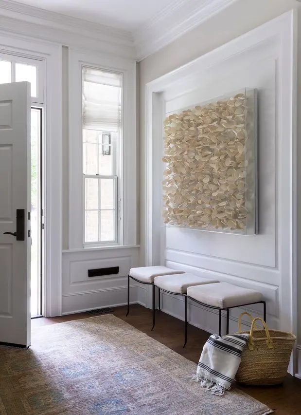
You stop seeing the fixtures. No bright bounce slides across the glass as you cross the room. The wall around each piece is quieter than the piece itself, so your eye goes where it was meant to and stays there. The reds are the reds the artist mixed. Guests walk up to things instead of past them.
And years from now, the work still looks the way it looked the day it arrived, which is the only measure that matters and the only one you cannot fix later.
Lighting a collection sits inside the larger discipline of architectural lighting design, where ceiling locations, daylight strategy, and control scenes get decided in one conversation rather than three. The difference between a painting that is lit and a painting that appears to hold its own light is easier to stand in front of than to describe. The QAV Experience Center in Centennial is open by appointment.

Art lighting design is the practice of putting controlled, color accurate, correctly aimed light on a work of art while limiting the total amount of light that work receives over its lifetime. Art lighting design is governed by two quantities rather than one, the illuminance on the piece at any given moment and the number of hours the piece spends at that level.
Conservation practice uses three tiers. About 50 lux for the most sensitive material, which includes works on paper, watercolors, photographs, textiles, and dyed leather. About 150 to 200 lux for moderately sensitive material such as oil and tempera paintings, painted wood, lacquer, bone, and ivory. About 300 lux for durable material such as stone, ceramic, metal, and glass, where the limit concerns how the object reads rather than whether it survives.
Modern LED sources emit essentially no ultraviolet, which removes one part of the problem that halogen, incandescent, and fluorescent lamps all created. Removing ultraviolet does not remove the risk, because visible light fades fugitive colorants on its own. A zero ultraviolet fixture aimed at a watercolor at 300 lux for ten hours a day still accumulates damage, since light damage depends on illuminance multiplied by hours.
Roughly thirty degrees from vertical, with the beam landing at the center of the piece, is the standard starting angle for a ceiling fixture aimed at a flat work. Light reflects off a surface at the same angle it arrives, so thirty degrees sends the bright bounce off glass or varnish below the eye of a person standing in front of the work. Closer to vertical rakes the surface and throws the frame shadow across the top of the piece. Closer to head on lifts the reflection into the viewer sightline.
Usually yes. A wall that catches a few hours of direct afternoon sun can take in more light energy in a season than a carefully lit museum piece receives in a year, which makes every fixture decision small by comparison. The order of fixes is placement first, then shades or drapery to cut the visible dose, then ultraviolet filtering film on the glass, then conservation grade glazing at the frame.
No. Light damage accumulates in proportion to total exposure and never resets, and faded pigment cannot be restored. A conservator can address a torn sheet or a yellowed varnish, but color lost to light exposure is gone permanently. Lowering light levels later slows further loss without recovering anything already lost.